The Falabella Group, Chile’s largest multinational department store chain, has redefined its image. In this way, the retail chain, popular with Chileans, Peruvians, and Colombians, seeks to demonstrate its success and growth to ensure the ease of integration of the various brands that make up its composition using a single platform – Falabella.com. Today the holding brings together a large number of brands from various business areas. Falabella, Sodimac, Linio, and Tottus represent department stores and supermarkets, tourism and banking, communications and construction, production and sale of household and interior items.
The holding carried out rebranding and creating an updated website with the creative agency Panda, which has 12 years of experience in individual design and hundreds of successful solutions. Having retained its general corporate identity, the company transitioned to a different color scheme – “orange,” making some changes in the graphics of the logo font. The new orange color of Falabella provided the creation of a modern and energetically active personality for the company. The unique font, created using various geometric shapes, demonstrates the individuality of each letter, which symbolizes the unity of all members of the holding with a pronounced individuality of each of them. At the same time, circles and curves, which were the basis for the formation of letters, create the required visual perception of flexibility and dynamism of the entire organization.
The same style was carried over to the new site’s appearance, giving its visual features. The latter’s task is to create convenience for online purchases in the entire trading network of the holding. That is why the site has acquired important user characteristics – visual ease of perception, ease of use, intuitive interface, and attractiveness.
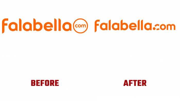
Forty years later, the sharp transition from green to orange has provided the required attention from regular users and those who rarely visit the network. Direct link to competitor’s orange branding – Cencosud became one of the main topics of discussion. Interestingly, the conservative audience expressed their dissatisfaction with this brand policy and noted that another logo change took place in a short time after the first rebranding. The font has undergone new changes, in which the letter “a” acquired a tail over the circle and “l” “turned” in the other direction. At the same time, “com” was removed from the circle and joined to the word “Falabella,” with a dot added after it. All this raises many questions about the thoughtfulness of rebranding. But all this may be just the beginning of something more splendid?!


