Archive | December, 2014

Set Theory: Tennis Stats, Beneath the Surface

28 Dec

Don’t bother looking; the year-end men’s tennis rankings are in, and I’ve failed to crack the top 100 – or even a few orders of magnitude beyond, if you insist on shining the flashlight on the whole list. I’m searching for a new coach but Ivan Lendl won’t take my calls, and I remain open to suggestions.

But if you need to know the names of the boys in white who did manage to serve-and-volley their ways past yours truly, check out the CoreTennis site’s Association of Tennis Professionals (ATP) listings for men, along with the Women’s Tennis Association standings, too. Here’s the men’s file:

 atp 2014

(You’ll probably want to untie the ribbons on the wrapped text in there and refit the columns, too.)

Now while the players are ranked indeed, the measure by which they’re ordered – the number of matches each contested – doesn’t quite seem to make the point. Are the best players those who simply step onto the court most often? I would think not, at least not invariably, though it makes considerable sense to suppose that players who’ve plied more matches are the ones who’ve likely gotten farther into the tournaments in which they’ve appeared. Or a large match quotient might tell us little more than the player’s determination to slot more tournaments in his diary. In fact, the correlation between a player’s match total and his winning percentage (the PCT field) works out to .681, impressively high to be sure, but not invariable. In any case a click of most of the headers will grant a re-sort of the data by that field instead (and note the pasted, sortable headers preserve their hyperlinks back to the CoreTennis site, and as such will respond to clicks in their cells with a return to their web sources. By creeping into the first link-bearer via the mouse and selecting the all others with a Shift-right arrow, click-free feint, and right-clicking the Remove Hyperlink option, unimpaired, standard cell editing will be enabled anew, however).

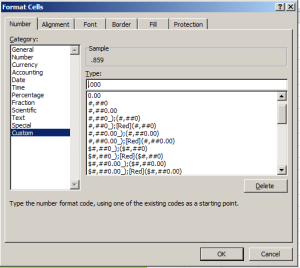
But the decision to sort the data by matches played is more editorial than operational, as is the confining of the dataset to a 40-player elite. So if you’re looking for something operational , then, look at the PCT field and its train of leading zeros. One runs into this supererogation rather often, and I don’t quite know why the sheetmeister here couldn’t have served up this custom format:

 tennis1

(Warning: tennis-themed pieces are dangerously pun-provocative. I’m trying to control myself, but no promises.)

Moreover – and this is an operational quibble, and a not entirely fair one here – it seems to me that the analyst, again as opposed to the reader, would be able to shape the data set sans any ranking field at all. And that’s because a pivot table can rank its contributory fields with the Show Values As > Rank Largest to Smallest/Smallest to Largest option as needed. But of course CoreTennis can’t be expected to capitulate to the spreadsheet lobby on this count.

Now about those headers, in particular three of the last four:

 tennis2

The source data don’t read that way, or course – so what’s happening here? Remember that, as with last week’s post, I simply copied-and-posted the rankings to my local spreadsheet (and by the way, appearances to the contrary, the data do not fill an Excel table, in that term’s contemporary sense; they’re nothing but a data set, all snug in their columns and rows), and the recipient cells have chosen to treat the headers as dates. Thus Excel reformats the first of the problem headers, natively headed 6-0 (and totalling the matches the player won six sets to none), into June 1900, the reckoning my US-date-formatted system assigns the expression. You want to see 6-0, though, and perhaps the simplest restorative is to type the Neolithic, text-defining apostrophe into the cell and simply re-enter 6-0, and repeat for the remaining dated cells. Note on the other hand that cell H1 – the one recording the 0-6 header – is, and always was, a texted thing, because if Excel regards the 6 in 6-0 as June, it can’t regard the 0 in 0-6 as anything at all. And when all else fails, the torpid text format jumps right in.

And had CoreTennis asked me, and rest assured they didn’t, I would have reassigned those three-lettered player country designations to a field all their own, and so freeing those data up to some useful pivot tabling. But as those abbreviations share a space with their citizens’ names, we might want to think about a formulaic extraction of the country codes.

And that’s a job for the MID function, a device I recruited in this post to extricate two-digit month identifiers from larger expressions. Here the task is a touch more formidable, because we don’t know exactly where in the respective player/country cells the county codes start. So here’s one – and just one – stab at the problem, working from cell K2 and literally addressing Roger Federer’s info in B2:

=MID(B2,FIND(“(“,B2)+1,3)

Here MID outsources its second argument – the character position at which the extraction is to commence – to FIND, which discovers and enumerates the whereabouts of the open parenthesis/bracket, in turn always one character to the left of the inception of the country code 0, and thus accounting for the +1. The final 3 instructs MID to grab that many characters from the cell, as all the country codes comprise precisely 3 letters.

Once you get that going, copy the formula down the K column (which I’ve field-named Country). Now you can pivot table a country breakout, e.g.

Row Labels: Country

Values: Country

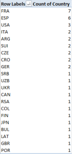
Sorting the numbers from Largest to Smallest I get:

 tennis3

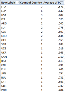
France leads the country representation, and that’s Spain (Espana) counting one less player (the women’s top 40 leads with the USA and Czechoslovakia, with five entries each. You could then slide the PCT field into Values, summarize these by Average, and subject the numbers to the same customizing pictured in the first screen shot up there:

tennis4

(Remember the numbers above average different players’ percentages, and as such don’t weight these for numbers of player matches played. But, those numbers are sufficiently close to accord them weighting parity, and in any event there may be good reason here to treat the individual percentages as equally contributory). Note Serbia’s (SRB) chart-topping .884. That kudo of course belongs to Novak Djokovic, but he’s a universe of exactly one. Needed here: more players to rank. And if you want to see my name in there, needed here: Ivan Lendl.
Let’s REFer to the Research Excellence Data

22 Dec

Compare and contrast, the test-makers like to say, and that alliterative injunction packs a redoubled punch across the Research Excellence Framework (REF) data put together by Research Fortnight, the self-described “leading independent source of news, analysis, funding opportunities and jobs for the academic research community” in the United Kingdom. You can compare the estimated six-year estimated funding prospects for 154 UK universities, driven by a weighted assay of their research standings and Research Fortnight-devised power ranks, and then compare the very handling of those numbers by the data managers at two national publications, the Guardian and the Telegraph here:

http://www.theguardian.com/news/datablog/ng-interactive/2014/dec/18/university-research-excellence-framework-2014-full-rankings

and here:

http://www.telegraph.co.uk/education/universityeducation/11299261/League-tables-the-top-universities-for-research.html

(Transparency check: remember, I teach an Excel class for the Guardian.)


Ok; now do you notice any formatting curiosities in the Guardian’s data capture?

 re1

Why, for example, should the wholly-integered Fortnight Power Ranks splurge to two decimal places, a question that could be even more pointedly posed of the counts in the Number of departments field?  And indeed – why Velcro a second decimal to the RF quality index data, when no meaningful values fill that space?

I’m not sure I can answer those questions, but eager to slake the acquisitive pangs of my hard drive, I clicked the petite Get the data link spaced below the Guardian table, and was taken nowhere. A pair of right clicks atop the table – one, to spark an internet-familiar menu, the other, to stab at the Export to Microsoft Excel option did what it usually does, nothing:

re2


Having vainly fought the good fight, it was time for a shameless resort to Plan C – a drag across the data, and a simpering copy-and-paste of them all into a blank Excel sheet (you may be able to start the copy with a right click > Select all try). But what I saw, apart from the need to unwrap the text from their constricting cells and auto-fit the Research staff column, was nothing if not interesting.

For one thing, those Power Ranks are more than just zero-freighted.  That digital exorbitance is aggrandized by still more, only-now-seen values pulling rightward from their decimal points, and if you like your bewilderment full-blown, take a hard look at those decimals. Each one mirrors the substantive value to its left, e.g., 11.0011, 81.0081, 53.0053, and this curious echo appears to sound across every number in the table in the Excel edition. I don’t presume to know what it means, but it’s there, as is the second decimal point speckling all but six of the ostensible numbers in the Power Rating and most of the other fields : 97.3097.3, 37.8037.8, and the like, an intrusive fillip which, among other things, degrades 147 aspiring Rating numbers into text.

There’s more.  The 2,409 Oxford staff attributed by the Guardian site undergoes a logarithmic leap to 24,092,409 in our spreadsheet, making for an astonishingly favorable faculty-to-student ratio, one bettered only by University College London’s 25,662,566, and that’s in a city numbering a village-small 8,500,000 residents.

What happened here? Again I really don’t know, although doubtless there are folks somewhere out there who have the answer (I read my emails). The revelatory powers of a simple copy-and-paste, through which net-sourced data make their actual, lengthier, suppressed values/text known to the spreadsheet setting, is something I’ve experienced before, and must have something to do with the movement from source data to web page. But in any case, my mystification sends me back to my semi-rhetorical question: do the complications we’ve encountered here matter?

Again, for the reader qua reader they don’t. As it stands and apart from its redundant decimals, the Guardian table presents no particular challenges to legibility, making for a rather straightforward read, once you acquaint yourself with the meaning of its fields. But the problem, of course, besets the analyst, those seekers of new and arresting finds who want to saddle up atop the data and take them for a ride. You can’t do much with 97.3097.3 if you want to count or average it.

That’s not to suggest that the data are beyond repair, but the process could get messy. To bring research staff sizes back to reality, for example, you could divide them, but  staff sizes above 1,000,000 require a denominator of 10,000, even as the smaller others make do with 1,000. And you could perform a Find and Replace for all the data’s decimals by replacing each point with nothing and thus requantifying these entries; but again, dividing these in order to restore their original magnitudes seems to require differently-sized divisors.

On the other hand, you could copy and paste the Telegraph’s rendition (itself a tricky business, as the table needs to be scrolled though; try keeping the left mouse button down and position it just beneath data as you continue to scroll; you may also have to hand-enter the field headers) and go to work. The numbers here are numbers (and by the way, the Power Ratings are calculated by dividing a university’s predicted share of funding by Oxford’s 6.24% percentage).

It’s clear, then, that the Telegraph thought through the data – precisely the same data – differently.  You’ll have to ask them all what they thought – and “them” includes Datawrapper, credited with doing the heavy lifting for the Guardian.

Let me know what they tell you.


Its Byte is Worse Than Its Bark: New York’s Tree Census

15 Dec

I am two with nature, professes Woody Allen, and this New Yorker is only too happy to corroborate his math.  I know nothing about the flora that roots itself in the city’s spaces, and with my gaze locked in perceptual auto-filter, I hardly see them at all. The only branch I’ve noticed lately is the one that belongs to my bank.

In other words, I can’t see the trees for the forest, but they’re there – about 623,000 of them, and the New York City Open Data site’s borough-wide arboreal inventory fills me in on each and every one of them, should I at last decide to make the acquaintance. Look here for the data:

https://data.cityofnewyork.us/browse?q=Street%20Tree%20Census&sortBy=relevance&utf8=%E2%9C%93

The census has pretensions to completeness, and given its address-level molecularity I’d guess it comes pretty close. In the interests of cross-county comparisons (borough equals county) I downloaded and copied-and-pasted the records to a consolidating master workbook, thus harvesting all 600,000 or so trees into one Sequoia-large data set, one that at 60 MB would do severe ecological damage to Word Press’s downloading channel. In other words, you’ll need to consolidate the above link’s offerings on your own.  (Note: the Staten Island data originate in DBF, or dBase mode, but follow the standard File> Open check-in with a specification for dBase Files (*.dbf), and the data will effect its proper spreadsheet mien. Note in addition that Staten Island’s Treepit numbers – referencing a field about which I know absolutely nothing – were minted in label format, and I don’t know why; but I’ve yet to work with them, either, so the matter remains moot, though curious.)

And the meaning of the entries in the set’s fields isn’t entirely forthcoming; preeminent among the recalcitrant is Species, whose coded tree names had me searching for a Boy Scout, at least until stepped on this document in the wilderness:

http://www.nycgovparks.org/sub_your_park/trees_greenstreets/treescount/images/species_list.pdf

Courtesy of none other than New York’s tree census.

After saving it all as a text file and pasting it into a new workbook sheet, feeding the names into a text-to-columns grinder and mashing the columnized names via a concatenating ampersand or two (e.g. =B3&” “&C3&” “&D3&” “&E3), I nailed and glued the whole goopy effluvium into a tottering VLOOKUP table that seems to be standing up to New York’s December gusts and showers. After next inundating the sheet’s next available column (which I titled Species Name) with lookup formulas that exchanged the codes for the full species names, and paved the formulas over with a copy Paste Special > Values hard-coded surface, the deed was done.

Now what? Well, note for starters that the folks of the New York design studio Cloudred  have cultivated an interactive chart of the trees and their species/borough distributions, leaving your character-based correspondent here to wonder about such other tree novella in there as might be learned. So how might the tree census tally broken out by the city’s zip (i.e. postal) codes work? Try running this by or through a pivot table:

Slicer (or Report Filter): BOROUGH

Row Labels: ZIPCODE

Values: ZIPCODE (Count)

Then try Slicing Manhattan, for example, and sorting the results Largest to Smallest. I get, in excerpt:

 trees1

Now here is where some New York-percolated smarts would hand-craft your understanding of the numbers should you want to key tree demographics to zip codes and their constituent neighborhoods (and if you’re in need of percolation, look to this zip code/service-area legend:)

https://www.health.ny.gov/statistics/cancer/registry/appendix/neighborhoods.htm

Heading the count is 10021, coding none other than Manhattan’s fabled Upper East Side, among the country’s poshest districts and 50% greener than silver medalist 10025, right across Central Park in the island’s Upper West Side, itself literally just above third-place 10024, somewhere in the middle reaches of the Upper West Side. The sociologists among you will wonder if class, politics, or the politics of class have committed their invidious inputs to the tree populations, or rather if territorial receptivities to the planting enterprise better explain the variance.  And for the curious, Staten Island –  containing far fewer human New Yorkers than any other borough but second only to Queens in the hardwood department  – can market its 10312 as the New York’s most tree-swarmed zip code, reporting 23,156 of those life forms to the authorities. (Note by the way the 24,000 zip-code-less entries in the data set, though, and I see no enumerations of park-resident trees, clearly an enormous and apparently uncounted cohort. It appears as if our data surveys address-bearing trees alone, unless I’ve got it way wrong.)

And you’ve been asking about New York’s tree diameters, and I hear you. They’re recorded here in what must be inches, and we can kick off with something simple:

Row Labels: BOROUGH

Values: DIAMETER (Average, squeezed to two decimal points. I get

The averages diverge notably, though you’ll need a greener thumb than mine pressing these keys to understand and explain why. Perhaps Manhattan’s penumbrous skyline stunts tree girths, but again you’re hearing that supposition from the wrong person – just ask Woody. If, on the other hand, you try this table out:

Row Labels: Species Name

Column Labels: BOROUGH

Values: DIAMETER (Average)

trees2

You’ll find some inter-borough comparisons across the same species that place the Manhattan diameters on the low side.

A few final points: As could be anticipated with a 623,000-record data set, some distinctly outsized numbers appear to have crept into the park. The 148-32 86th Avenue address in Queens’ Jamaica neighborhood boasts a 2100-inch-diametered  tree, and my Google Maps photo just doesn’t capture it. At 175 or so feet in width, I think it would show up.

The last point: the data with which we’ve been working hold up the back end of what New York Open Data showcases in the first instance as a set of borough tree-positioning maps of the census. Here’s the one for Manhattan:

trees3

Maximum coverage – maximized information? That’s called a rhetorical question. Here’s a couple of mine:

The Bronx

Manhattan

Putting OEDC Asylum Data on the Table

5 Dec

Shopping for spreadsheets? If you’re in the neighborhood, poke through the inventory at the Organization for Economic Co-ordination and Development, acronymized OECD, you’ll be happy to know. We’ve been here before, on July 25 to be exact;  but I told you it’s a large inventory.

In fact there appear to be several points of ingress to the holdings, but here’s one

http://data.oecd.org/

a self-described Public Beta page that enables you to “Find core datasets in the data warehouse and make your own tables and charts in OECD Stat Extracts”, a triflingly ambiguous inducement, appearing as it does to conflate the term “datasets” and the “Database” informing the title atop the quoted passage, but again, that’s a trifle.  More to the point is the availability of the data in either unmediated spreadsheet form, or downloadable as such via an Export button.

In any case one such set, a brief of statistics on asylum seekers to OECD circa 2013, seized the attention of the Guardian’s datablog (note that site’s redesign, and the disappearance of its erstwhile Data link from its home page), and is the one I think I’ve managed to capture here -even as the OECD heads its source page Stacks and flows of immigrants, 2002-2012 and so seems to have made off with a year (I’ve also retitled the workbook, overwriting its long, number-beset native name):

Inflows of Asylum seekers in OECD members and the Russian Federation

A first view of the sheet exposes it in Page Break Preview, a perspective on the data that won’t particularly advantage the analyst, and so you’ll want to make your way back to the standard Normal View. Moreover, the recourse toward the Freeze Panes selection at the columnar intersection of A and B seems puzzlingly needless, as the sheet bares all its numbers and country names immediately. I’d unfreeze the panes right away, even as I continue to wonder about the dictionary form which Microsoft mines its verbs. What would your teacher say about unfreeze? In addition, the missing field header in column A needs to be supplied.

Note, on the other hand, the proper distancing of both the sheet’s title and its yearly grand totals from the body of the data with the expedient of choice, the blank rows. But at the same time recall the OECD’s invitation to its visitors to “Find core datasets…and make your own charts and tables…”.  Again, our sheet assigns its yearly data to one field per year, when in fact all the years and their associated numbers would more profitably be reined into greater, subsuming fields. Not this, then:

oedc1


Butt again, this:

oedc2

(For a straightforward review of the means toward the above transformation over and above what I’ve said about it, look here.)

The companion question, then, is what plans the OECD have for the data once they hand them over to us. True, the workbook’s as-it-stands configuration does happily supports a round of charting, but less certain are the data’s congeniality to making “your own tables”. Once, however, the information fills the pared-parameter shape assumed by the second of the above screen shots, the prospects for this kind of pivot table loom a lot larger:

Row Labels:  Country

Column Labels: Year

Values: Values

Now this facile breakout of the asylum numbers by year is ready to happen, because all the years share the same Year field as an item. Try the above pivot table that when the each and every year occupies a field to itself.

But hold on. When the pontificating is done, my self-assured amelioration cooks up nothing but precisely the worksheet that already presents itself at the point of download:

oedc3

Same numbers, same juxtaposition of fields. So what was my point?

That’s a sweat-inducingly good question. But once all those years and their concomitant data recuse themselves from fields into items you can also treat the values to the % of Row Total styling, and learn, for example, that 30.88% of Turkey’s asylum seekers during the 2002-13 interval made their way to that country in 2013 alone, a clear attestation of the Syrian conflict’s scattering effect upon its populace. Less obvious is Hungary’s 2013 percentage of 37.22 of all the seekers it received across the 12 years, a skew I can’t yet explain.

Now consider this OECD book, counting member populations by their residents’ country of origin:

OEDC Immigration data 2011

Compare that far larger dataset’s field structure with that of the one above, e.g.

oedc4

That’s really more like it, even if the data themselves could stand some clarification (I’d bang out a lookup table that would return country names in full, and the data are available on the OECD site in a PDF for doing so. Is AUS, after all, Austria or Australia?).

And these variously-structured workbooks drag one ore question into the fray: why should some OEDC workbooks be stitched along this, or that, pattern of design – fields as items, or items as fields? I don’t know, that answer; nor do I know if the OEDC has endeavored to think about it.

But I’ll be happy to think about it, folks.  Here’ – I’ve attached my business card.